Dashboard
Neondeck is a full-viewport developer cockpit that adapts to the space you give it. Open it in a regular browser window, install it as a web app, pin it to a portrait panel, or stretch it across an ultrawide companion display—the same configured regions reflow around the measured dashboard shell.
The deck in action
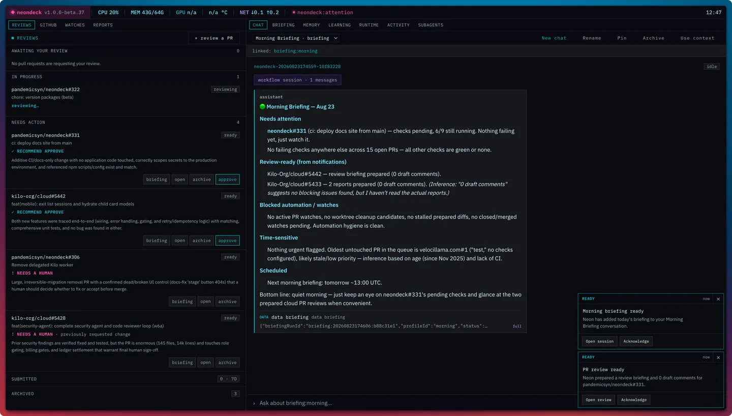
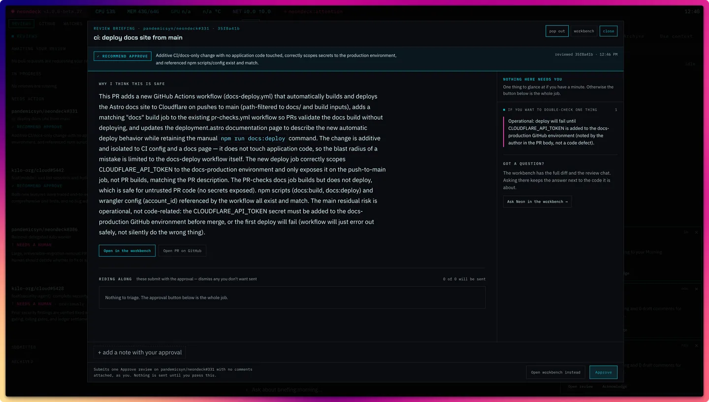
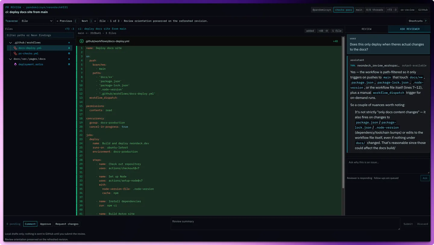
The work queue and morning briefing keep review decisions in view; a PR can then open into either an explicit briefing or the focused review workbench.
Responsive layouts
In auto mode, Neondeck observes the dashboard shell with a
ResizeObserver. It classifies the shell only when a width
or aspect-ratio boundary is crossed, then chooses one of two
structural arrangements: the authored grid or a height-contained
vertical column. Resizing a window does not rewrite dashboard.json.
| Resolved profile | Current boundary | Arrangement |
|---|---|---|
| Compact | Shell width below 640px | Vertical column |
| Portrait | At least 640px wide; aspect ratio below 1.1 | Vertical column |
| Wide | Aspect ratio from 1.1 up to 2.2 | Authored grid |
| Ultrawide | Aspect ratio 2.2 or wider | Authored grid |
The column arrangement keeps the whole cockpit inside the viewport. Data regions form a compact band, the primary agent region grows into the remaining space, and each panel handles its own scrolling. This is app-style responsiveness rather than a document page with body scroll.
Choose a layout mode
| Mode | Behavior | Use it when |
|---|---|---|
auto |
Measures the real shell and selects grid or column. | Default; regular browser windows and resizable app windows. |
xeneon |
Pins the ultrawide grid arrangement. | A fixed companion strip where reflow would be undesirable. |
stacked |
Pins the portrait column arrangement. | A fixed vertical panel or deliberately single-column cockpit. |
Four controls, four different jobs
“Layout” can refer to several related settings. They cooperate, but none is a substitute for the others.
| Control | What it controls | What it does not control |
|---|---|---|
layout.mode |
Responsive arrangement: measured, forced grid, or forced column. | Browser choice and window bounds. |
layout.columns, rows, regions |
Panel placement and spans in the authored grid. | The physical size of the browser window. |
display |
Target-display metadata used for defaults and previews. | The live responsive classification; the shell is still measured. |
windows |
Named Chromium launch-time size, position, and kiosk profiles. | Panel placement inside the dashboard. |
Open and place the dashboard
Use the operating system default browser
neondeck openThis is the normal path. Neondeck waits for the local server and then delegates the URL to macOS, Windows, or Linux. The browser decides whether that becomes a tab or a window; Neondeck's responsive layout handles the available viewport. If no login service is installed, Neondeck keeps the server attached to this terminal; press Ctrl-C to stop it.
Opt into Chromium window placement
neondeck open sidebar --browser "/path/to/chromium"
neondeck open xeneon --browser "/path/to/chromium"
Passing --browser launches that Chromium-family executable
with --app. Only this explicit path applies a named
window profile or the one-shot --width, --height,
--x, --y, and --kiosk flags. Width
and height must be supplied together; x and y must also be supplied together.
| Shipped profile | Bounds | Intent |
|---|---|---|
sidebar |
480 × 1400 at (0, 25) | Tall companion panel beside the primary workspace. |
xeneon |
Kiosk at (3440, 0) | Dedicated ultrawide strip at a machine-specific display origin. |
Install it as a web app
The production dashboard includes a web app manifest. Safari's File → Add to Dock and Chrome or Edge's Install Neondeck flow create a standalone app window with its own dock icon and browser-managed remembered bounds. This is usually the best long-term sidebar setup; launcher geometry is better for scripted kiosk placement. The app requires the local Neondeck server and does not cache an offline dashboard.
Configure the cockpit
Mutable dashboard configuration lives at
NEONDECK_HOME/dashboard.json, then the normal
runtime-home fallbacks described in Configuration. New runtime homes receive the checked-in config and JSON Schema.
This compact example shows every layout layer working together:
{
  "$schema": "./dashboard.schema.json",
  "schemaVersion": 1,
  "display": {
    "preset": "xeneon-edge",
    "width": 2560,
    "height": 720
  },
  "appearance": {
    "density": "comfortable"
  },
  "theme": "system",
  "windows": {
    "sidebar": {
      "width": 480,
      "height": 1400,
      "x": 0,
      "y": 25
    },
    "xeneon": {
      "kiosk": true,
      "x": 3440,
      "y": 0
    }
  },
  "statusline": {
    "position": "top",
    "pluginId": "host-metrics",
    "config": {}
  },
  "layout": {
    "mode": "auto",
    "columns": 12,
    "rows": 5,
    "regions": [
      {
        "id": "work",
        "title": "WORK",
        "column": 1,
        "row": 1,
        "columnSpan": 4,
        "rowSpan": 5,
        "defaultTab": "reviews",
        "tabs": [
          {
            "id": "reviews",
            "title": "REVIEWS",
            "pluginId": "reviews-panel",
            "config": {}
          },
          {
            "id": "watches",
            "title": "WATCHES",
            "pluginId": "active-watches",
            "config": {
              "limit": 8
            }
          }
        ]
      },
      {
        "id": "neon",
        "title": "NEON",
        "column": 5,
        "row": 1,
        "columnSpan": 8,
        "rowSpan": 5,
        "defaultTab": "chat",
        "tabs": [
          {
            "id": "chat",
            "title": "CHAT",
            "pluginId": "flue-chat",
            "config": {
              "agentName": "display-assistant"
            }
          }
        ]
      }
    ]
  }
}
Regions, tabs, and plugins
A region is one panel in the authored grid. Its one-based
column and row select the starting cell;
columnSpan and rowSpan control its footprint.
Each region contains one or more tabs, and every tab selects a typed dashboard
plugin with pluginId plus plugin-specific
config. defaultTab, when present, must match
a tab id in the same region.
The shipped dashboard uses a four-column work rail and an eight-column Neon region on a twelve-column grid. In column mode, numeric grid coordinates stop driving visual placement: data regions form the upper band, the agent region grows below them, and the configured status line remains pinned to its chosen edge.
| Surface | Built-in plugin ids |
|---|---|
| PR work | reviews-panel, github-pr-list, active-watches, reports-panel |
| Neon and runtime | flue-chat, briefing-panel, runtime-overview, activity |
| Memory and learning | memory-panel, learning-operator, subagent-summary |
| Status line | host-metrics, clock-status |
Operator surfaces
Keep pull requests moving
Reviews, GitHub PRs, watches, checks, and generated reports stay in one work rail. A PR opens into the focused review workbench with a searchable tree on wide layouts and a compact selector on narrow ones. The human drafts and submits every GitHub review verdict.
Operate Autopilot without hiding authority
Active Watches exposes the current mode, owner activity, prepared changes, pause and recovery controls, and review entry points. See the Autopilot guide for delivery authority and mechanical guards.
Keep Neon and runtime state visible
Chat, briefings, runtime setup, activity, memory, learning review, and subagent summaries share the second region as tabs. Linked work can open context-aware sessions without forcing a permanent side-by-side chat layout.
Theme and readability
theme accepts dark, light, or
system. appearance.density accepts
compact, comfortable, or large,
and
appearance.textScale provides a 0.9–1.75 readability multiplier.
These settings change presentation without changing the region map.
Supported config actions publish events through Neondeck's local event stream, so affected dashboard surfaces refresh without a full browser reload. The web dashboard is the first operator UI; a future TUI is intended to reuse the same backend APIs and events rather than create a second agent runtime.